A memorable challenge coin starts with a clear reason for existing. Whether it recognizes service, celebrates an anniversary, marks a milestone, or strengthens team identity, every design choice should point back to that purpose. If you are ready to explore ideas visually, you can design your own challenge coin online while keeping the final recipient and message in mind.
The best coins do not try to say everything at once. They combine one meaningful idea with readable details, an appropriate finish, and a design that feels worth displaying, carrying, or collecting. A coin can be highly detailed, but it should still make sense at a glance.
Table of Contents
- 1 Table of Contents
- 2 Start With the Coin’s Purpose
- 3 Design for the People Receiving It
- 4 Build One Clear Visual Story
- 5 Plan Both Sides Before Adding Details
- 6 Keep Words Short and Easy to Read
- 7 Choose Colors, Finishes, and Textures With Care
- 8 Match Size and Shape to the Design
- 9 Avoid Common Challenge Coin Design Mistakes
- 10 Review the Proof Before Production
- 11 Use a Simple Design Checklist
Table of Contents
- Start With the Coin’s Purpose
- Design for the People Receiving It
- Build One Clear Visual Story
- Plan Both Sides Before Adding Details
- Keep Words Short and Easy to Read
- Choose Colors, Finishes, and Textures With Care
- Match Size and Shape to the Design
- Avoid Common Design Mistakes
- Review the Proof Before Production
- Use a Simple Design Checklist
Start With the Coin’s Purpose
Before selecting colors or artwork, define what the coin should help people remember. A recognition coin may focus on an achievement and recipient name. An event coin may feature the event date and location. A memorial coin may call for a quieter tone, a symbolic image, and a brief message. Purpose gives the project boundaries, which makes stronger design decisions easier.
Design for the People Receiving It
Consider who will receive the coin and how they are likely to use it. A formal organizational award often benefits from a classic shape, restrained colors, and a clean emblem. A coin for a volunteer group, school club, reunion, or creative team can support more personality. Think about whether recipients will carry it, place it in a display case, trade it, or give it to someone else.
Challenge coins are closely associated with recognition and group identity, although the exact origin story is debated. The challenge coin tradition has become especially visible in military settings, where coins can represent units, accomplishments, and shared experiences. That same sense of belonging can guide a coin for almost any group.
Build One Clear Visual Story
A successful coin usually has one dominant idea. Start with a main symbol, such as a mascot, crest, landmark, tool, animal, or meaningful object. Then add only the supporting details that make the idea more specific. Borders, background textures, dates, and small icons should guide attention toward the main image rather than compete with it.
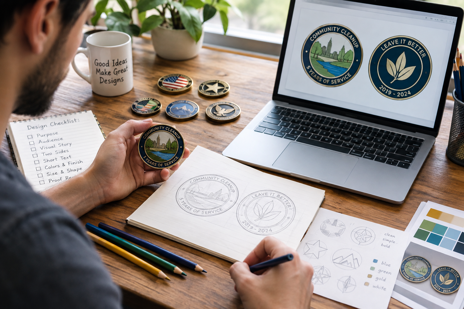
Photorealistic candid documentary-style photo of a designer reviewing a challenge coin concept at a slightly cluttered worktable, with several sample coins, rough sketches, colored pencils, and a laptop showing a simple two-sided coin layout; natural window light, realistic shadows, imperfect workspace, genuine in-the-moment lifestyle feel.
For example, a community cleanup group celebrating five years of service could place a simple local landmark on the front, framed by the group name. The back could feature a small leaf or work-glove symbol, the milestone year, and a short phrase such as “Leave It Better.” The design tells one connected story without becoming crowded.
Plan Both Sides Before Adding Details
Treat the front and back as a pair from the beginning. Give each side a job. The front can carry the main identity, while the back can hold a motto, achievement, date, or recognition message. This approach prevents one side from becoming overloaded while the other feels unfinished.
Use a simple two-side planning process
- Sketch the main image and required wording for both sides.
- Decide which side should make the strongest first impression.
- Reserve space around the edge for borders and curved text.
- Make sure recurring colors, symbols, or type styles connect the two sides.
Keep Words Short and Easy to Read
Text should add meaning, not turn the coin into a miniature brochure. A short motto, unit or group name, date, title, or location is often enough. Remove filler words and avoid squeezing multiple sentences into a small space. If a phrase cannot be read quickly at the finished coin size, shorten it or move the message to accompanying packaging.
Letter spacing matters as much as wording. Curved edge text needs room to breathe, and tiny lettering can lose clarity when translated into metal and enamel. Review all names, dates, titles, and numbers carefully before approving the artwork.
Choose Colors, Finishes, and Textures With Care
Color and finish should reinforce the theme. High contrast helps separate lettering from its background, while a limited palette often looks more intentional than a large collection of unrelated colors. Polished metal can create a crisp, formal feel. Antique finishes can emphasize recessed details and give the design a more traditional appearance. Textured backgrounds can add depth, but they should not interfere with small type or detailed artwork.
Real-world coins often become meaningful because of the memory attached to them, not simply because of their material. An Army story about a class coin illustrates how a distinctive concept and shared connection can give a small design lasting significance.
Match Size and Shape to the Design
Size affects legibility, weight, and the amount of detail a coin can support. A larger coin gives artwork and text more breathing room, while a smaller coin encourages a simpler layout. Traditional round coins suit many projects because they feel familiar and balanced. Custom shapes work best when the outline itself adds meaning, such as a shield, badge, state silhouette, vehicle, or mascot.
Avoid Common Challenge Coin Design Mistakes
- Using too many unrelated symbols on one side.
- Adding lettering that is too small to read comfortably.
- Choosing colors with weak contrast.
- Copying a familiar idea without adding a personal connection.
- Forgetting that fine artwork may change when produced in metal relief.
- Approving a design without viewing it at its intended size.
Review the Proof Before Production
A proof review is the final opportunity to catch avoidable errors. Check spelling, dates, names, numbers, borders, and both sides of the coin. Look closely at thin lines, crowded areas, and text near the edge. Ask whether the central image remains clear and whether the final design still fulfills its original purpose.
Use a Simple Design Checklist
- The coin has one clear purpose.
- The main image is easy to recognize.
- The wording is brief and readable.
- The front and back tell a connected story.
- The colors and finishes support the design.
- The size and shape fit the level of detail.
- The proof has been reviewed carefully.
A coin people want to keep does not need every available feature. It needs a clear purpose, a memorable image, readable wording, and details that matter to the people who receive it. When every element supports that shared meaning, the finished coin can become more than a keepsake.